Work
Last month I found myself trapped in the seventh circle of a banking app, desperately trying to transfer money to my daughter's school for a field trip. Forty-five minutes and sixteen screens later, I was contemplating a career change to professional hermit. "Surely," I thought, staring at yet another inexplicable error message, "there must be a better way to design this digital hellscape."
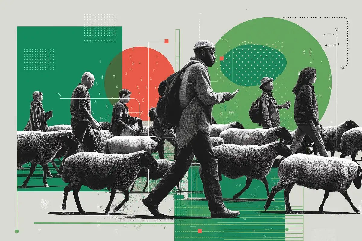
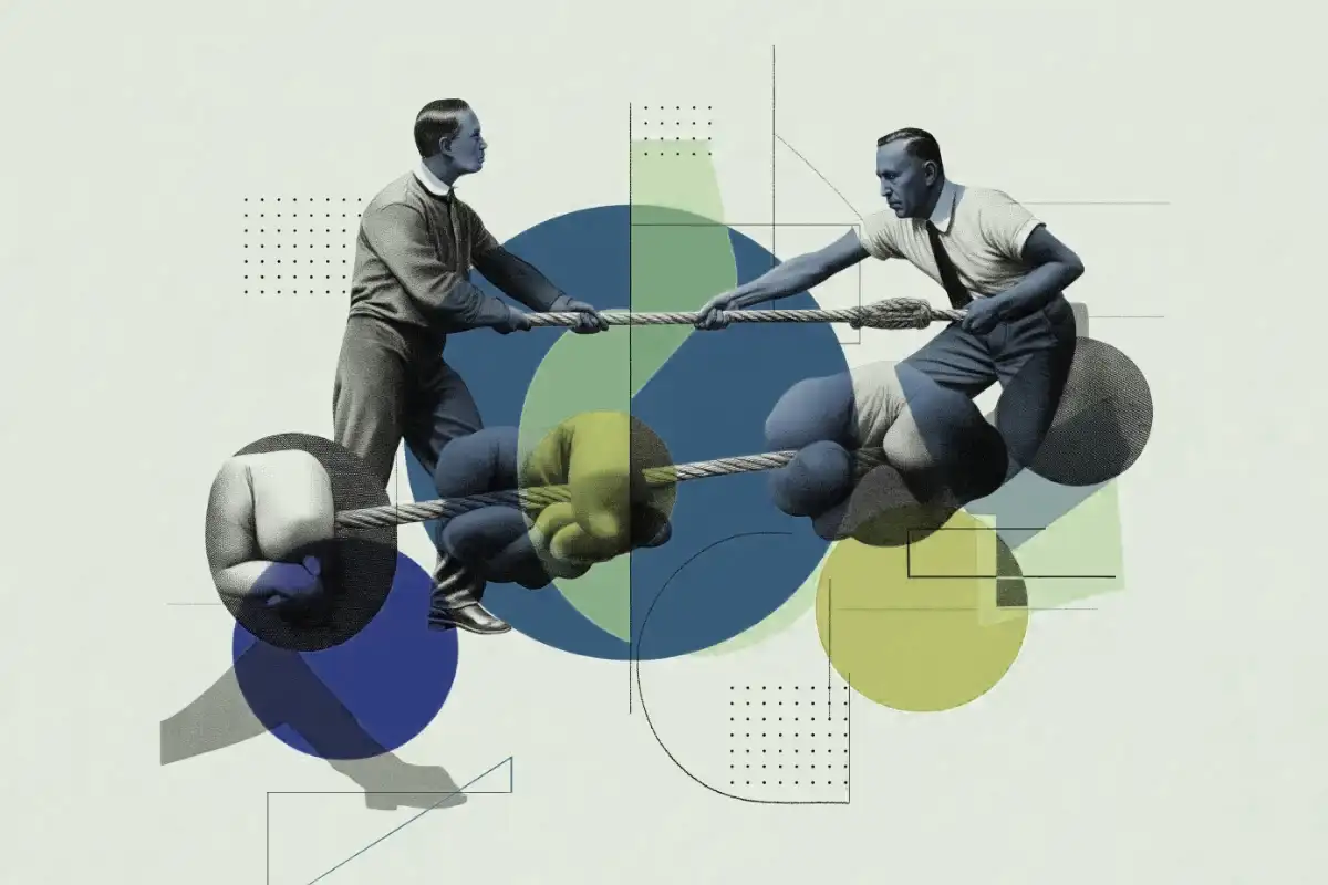
This, my friends, is what happens when user flows go terribly wrong. Like sheep without a good border collie, users wander aimlessly, eventually giving up and deleting your app with the satisfaction of someone squashing a particularly annoying insect.
What is a user flow?
A user flow is the path a poor, unsuspecting human takes to complete a task through your app. It's the digital equivalent of those floor arrows in IKEA. Except when done right, they lead somewhere useful instead of trapping you in an endless loop of affordable Swedish furniture.
At its core, a user flow maps the entire journey from entry point (like a landing page) through various actions and decision points to a successful outcome (purchasing a product, signing up, or simply finding information without having an existential crisis).
I used to treat user flows as a nice-to-have – something to sketch on a whiteboard, then promptly ignore when deadlines loomed. That approach gave us an app that one user described as "feeling like a child stuck in a hall of mirrors at a funfair."
The anatomy of a
non-terrible user flow.
Every decent user flow starts with understanding where your users are coming from. Are they clicking an ad? Landing from search? Each entry point creates different expectations and needs.
From there, you need clear action points. My team learned this lesson when our "Submit" button was accidentally labeled "Skip" resulting in a confusion about where to go next.
Decision points are where users choose their own adventure. Like when my wife asks where I want to eat dinner, there should ideally be fewer than 17 options, all of them clearly defined. Nobody needs the digital equivalent of "I don't know, what do YOU want?"
Feedback is crucial – users need to know their action worked. Our early prototype responded to form submissions with a blank screen, leading users to tap "Submit" repeatedly until our database looked like someone had fallen asleep on the keyboard.
Why most user flows are rubbish
(possibly including yours).
In a moment of painful self-awareness, our team realized our app's user flow resembled a plate of spaghetti thrown against the wall. We weren't alone – many products suffer from these common pitfalls:
- Too many steps between actions and outcomes.
- Confusing and complicated navigation.
- Dead ends in the user flow.
Our design mapped the existing flows using a wireflow approach – combining wireframes with flow diagrams to visualize the actual screens users see and the connections between them. The results were horrifying. Our supposedly simple sign-up process looked like a conspiracy theory wall.
How we fixed our mess
(& how you can too).
We identified three critical issues:
- Users had to navigate eight screens to complete a basic profile setup.
- Our error messages were both vague, technical and offered no solutions.
- The back button sometimes worked, sometimes didn't, and sometimes sent users to an entirely different feature – a sort of navigational roulette.
We implemented progressive onboarding – revealing information only when contextually needed rather than overwhelming users upfront.
The results:
Less suffering, more success.
After six weeks of testing and iterating, our new user flows yielded immediate results:
- Customer service tickets about "getting lost" in the app dropped.
- The average time to complete key tasks was cut in half.
The most instructive discovery was that nobody reads instructions. Ever. Not even when they're large, colorful, and accompanied by helpful animations. Users are like toddlers at a birthday party – they're going to head straight for the cake regardless of your carefully planned schedule.
This meant designing for intuition rather than education. We couldn't make users read directions, but we could make interfaces so obvious that directions became unnecessary.
How to know
if your user flow needs work.
If any of these sound familiar, your user flow might be the digital equivalent of a maze:
- Users frequently contact support asking how to perform basic functions.
- Your app has earned sarcastic reviews comparing it to complex mathematical theorems.
- You yourself get lost when demonstrating the product to new users (a particularly humbling experience I've endured).
- User testing sessions frequently end with awkward silence or nervous laughter.
Remember, every additional friction filled step in your user flow is another instance of where your customer considers switching to a competitor. The path from A to B should be short, clear, and preferably sprinkled with small dopamine hits of accomplishment along the way.
The human element.
In our obsession with perfecting flows, it's easy to forget we're designing for humans – wonderfully irrational, easily distracted, occasionally brilliant humans. Like the Polaroid team discovered, bringing developers into the design process earlier created true partnerships and better products.
My twin daughters recently described our family's morning routine as "chaotic nonsense with occasional toast." That's what most users think about your app before you optimize the flow. Your job is to turn it into "pleasant journey with guaranteed toast."
A good user flow isn't about forcing people down a predetermined path – it's about making the right path so obvious and frictionless that it feels like their idea all along. Like the best parenting, the best design makes people feel smart rather than controlled.
So go forth, map those flows, remove unnecessary steps, and remember: somewhere out there, a user is thanking you for not making them want to throw their phone into the River Shannon. And in the world of UX design, that's about as good as it gets.